Thursday, 22 November 2012

Photo Montage

Kurt Schwitters


From 1923 he worked as a commercial artist, graphic designer and typographer for several companies from Hanover and beyond. In 1927 he founded the 'ring neuer werbegestalter' (circle of new commercial artists). Apart from his professional work, he continued the collages and material pictures of the 'Merz'-series. In the mid-30's he was successful on an international level for the first time; in 1937 he emigrated to Norway. His exile in Norway was followed by his escape from the German troops to England, where his isolated position, from which he already suffered back in Norway, did not improve significantly. 
Photo Montage

Man Ray


Man Ray's career is distinctive above all for the success he achieved in both the United States and Europe. First maturing in the center of American modernism in the 1910s, he made Paris his home in the 1920s and 1930s, and in the 1940s he crossed the Atlantic once again, spending periods in New York and Hollywood. His art spanned painting, sculpture, film, prints and poetry, and in his long career he worked in styles influenced by CubismFuturismDada and Surrealism. He also successfully navigated the worlds of commercial and fine art, and came to be a sought-after fashion photographer. He is perhaps most remembered for his photographs of the inter-war years, in particular the camera-less pictures he called 'Rayographs', but he always regarded himself first and foremost as a painter.
Photo Montage

Richard Hamilton

Hamilton was a member of the Independent Group, formed in the 1950s by a group of artists and writers at the Institute of Contemporary Arts, whose symposiums contributed to the development of Pop art in Britain. He was one of the prime practitioners of the critic Lawrence Alloway's theory of a fine/pop art continuum. Hamilton interpreted this as meaning that 'all art is equal - there was no hierarchy of value. Hamilton designed a collage in 1956 called 'Just what is that which makes today's homes so different?' this soon became one of the most famous pieces of art in 'pop art'.

Photo Montage

Gustav Klutsis

Gustav Klutsis was a Latvian painter, sculptor, graphic artist, designer and teacher, active in Russia. He was an important exponent of Russian Constructivism. As well as for his designs of practical structures like kiosks, tribunes, and radio-orators, Klutsis became a professor of colour theory at the Constructivist school VKhUTEMAS in 1924. Klutsis designed posters which during the war he designed propaganda for the Russians.

Photo Montage


David Hockney

By his mid-20s Hockney was already one of the most critically acclaimed artist in Britain, at 26 he had his first one man show and was awarded first prize in the John Moores Exhibition in 1967.
Hockney worked in a variety of fields as a painter, draughtsman, printmaker, photographer and designer.

Thursday, 15 November 2012

Photo Montage

Peter Blake

Peter Blake is an artist who showed 'Pop Art' to many with his very colourful paintings and artwork in which he was one of the first to introduce pop art.
Blake first started his career as an artist with an education at the Gravesend Art School when he was just 16. After a short period of enrolment in the R.A.F., he continued his art studies at the Royal College from 1953-1956 and in the latter half of the ‘50s first earned significant critical acclaim, exhibiting in the R.A. and winning both the Leverhulme Research Award and first prize in the Junior section of the John Moores Liverpool Exhibition. The increased popularity of his work led to the string of album sleeve commissions which, alongside his work for the Beatles, included sleeves for the Band Aid single Do They Know It’s Christmas?, Paul Weller’s Stanley Road and The Who’s Face Dances (1984, 1995 and 1981 respectively) as well as the more recent Oasis Greatest Hits album Stop the Clocks in 2006. Blake was was appointed an R.A. in 1981, awarded a C.B.E. in 1983 and finally knighted for his services to art in 2002. Peter blake has done some amazing work through out his life and has inspired many people into the world of Pop Art with his bright and colourful artwork in the past.
Peter Blake's Art work
The beatles Album cover                               'I love you'
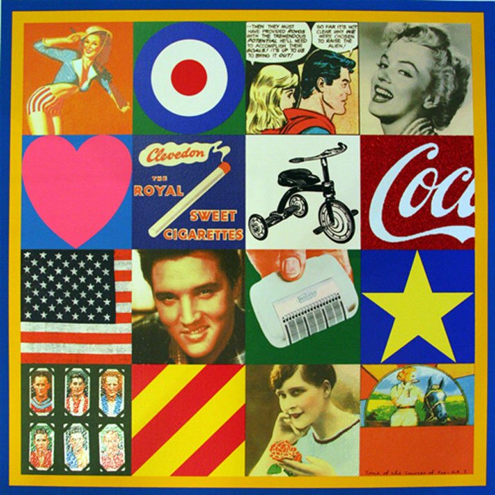
These Are some of the most famous art pieces that peter blake has designed in the past.
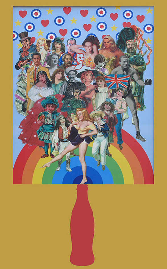
Thursday, 27 September 2012

 Adam James Turnball

Adam James Turnball's blog is very good and well laid out. I am following this blog because I like how he presents his work and he uses nice and simple colours to crate his work. He may just use black and white or have three colours in his work but how he uses it is clever as he can create a person and still use the same colour for all the detail and the title. I also like how he has bright coloured backgrounds and mainly uses a cream or black to do all the detail to the image.
 Delicious Industries


I found this blog very interesting and I like how the the typography is used because it stands out over anything else that is in the image plus the range of colours that have been used are very clever as the artists use a very bright and colourful range of colours which give a happy and warm feeling where as if you had dark green as the typography with a black background you would not be able to see it and it would be very dull. The artists use simple colours and do not use too much of these colours which makes the typography stand out more, I think it is simple and a very effective idea. I have noticed that the colour which most artists use in the background is black, this is good as the typography will be more eye catching.  I like this blog because the artists use few colours and the typography is bright and bold and with the background as black it works exceptionally well.

(Sorry about the bad language)

 Concept art world

http://conceptartworld.com/ has  a dark and deep feeling to it, the majority of the pictures have a background which fades out to get darker and darker. The dark and dull colours are effective and shadows are a big part of concept art as they can tell how a character's personality may be. I have noticed that with Concept art the artists try to fill as much of the page as they can and make it as detailed as possible. This some how catches the eye and where ever you look on the page it is full with detail. I am following this blog because I think it is very useful and detailed, alot of the images are of sci-fi or action games or films and a lot of effort has gone in to creating these images. It is inspiring to see something you like and artists creating such amazing art about it.

Too Many People!


Tomer Hanuka


This poster which Tomer hanuka designed is of the film 300. This poster is of a scene where Leonidas has to claim his title to become king and kill the man-eating wolf.
The layout of this poster is simple and few colours have been used. The layout is Leonidas holding his weapon and the wolf circling around him. The features on the wolf’s face such as the eyes and mouth are the colour red and red is associated with death and blood and this could be why Hanuka has put this colour in the wolf’s face because it is blood thirsty. Leonidas has cuts on his back and legs and just this one colour change tells what has happened. The Title of the film 300 is used in a scribble like blood on the wall and it has splats and splodges of the red ink or blood. This title comes across to say that maybe the film is brutal and gory.
In the poster the wolf looks like it has been stuck onto the poster because it has a misty brown colour. The wolf also looks like it has starved because it’s has a very thin stomach. I think the colours in this poster especially the background does not suit the book and film because the scenery is in a canyon and it is very dark and dulland you can only see the wolf’s eyes. However though, Hanuka could also be referring to Frank Miller’s graphic novel.
This scene is the first scene in the film and I do not consider it to be one of the most important scenes in the film, the fighting scenes are because it is an action film.